Table of Contents
Much like the common crow is attracted to shiny objects, social media users love some good visual content.
We usually experience social content with our eyes first, after all. And with so much content out there, it’s important for brands to stand out visually.
Keep reading to find out how to create visual content that will blow your audience’s socks off. Plus, check out the stunning visual content examples we’ve curated for your viewing pleasure!
Bonus: Get the always-up-to-date social media image size cheat sheet. The free resource includes recommended photo dimensions for every type of image on every major network.
Visual content on social media is image-based content posted on social media platforms.
Not to state the obvious, but visual content is content with a visual element. It’s not just text-based. And it’s a treat for the eyes, too. For example, a classic 280-character Tweet isn’t visual, but a Tweet with a photo attached is.
There are a few different types of visual content that digital marketers use.
Images
You’ll find still images on pretty much all social media platforms. They’re the most common form of visual media content.
Really, saying “images” as a type of content is a bit of a cheat. Every type of visual content is imagery in some way. Videos, for example, are simply a series of still images shown quickly.
Videos
Video content on social media has risen in the ranks of popular content because it’s highly engaging. Now, most content marketing strategies include video in some capacity. This content can look like short-form video clips, gifs, or long-form storytelling.
Engaging content like video is great for:
- creating tutorials,
- giving a behind-the-scenes peek into your brand, or
- visual storytelling.
Infographics
Infographics are a mix of graphics or illustrations and text. Their intention is to explain information in a visual way.
Infographics are great for presenting complex data or showing how to do something.
Memes
Who doesn’t love a good meme? Memes are popular images or videos that are funny, easy to understand and easily shared. They can reference pop culture or make social commentary. These factors all contribute to the viral nature of a meme.
GIFs
GIF stands for Graphics Interchange Format. GIFs are short, soundless video clips that repeat endlessly.
They’re often used to convey reactions or highlight a moment.
Live videos
Live videos are video streams happening in real time. They allow creators to interact with their viewers and are great for helping build rapport with an audience.
Live videos can include Q&A sessions, interviews, unboxings, or simply watching a streamer play video games.
Spend any time on social media, and you’ll see that visual content is more engaging than text-based content.
You don’t need to take our word for it, either. LinkedIn reports that video drives 5x more engagement than any other kind of content. Live streaming, notably, generates 24x more engagement. LinkedIn posts with images will typically net you twice the comments as posts without.
Digital video ad spending amounted to nearly 176.63 billion dollars in 2023. And 90% of marketers report a good ROI from video marketing. Plus, out of all the social platforms out there, people spend the most time on YouTube.
So it’s no surprise that 69% of B2B marketers say they’ll be investing in video content marketing in 2024. Don’t sleep on still images, either. They can take less effort to produce and 70% of marketers overall believe visual media content pulls in better business results.
Learn more about what social media can do for your marketing.

The formula for going viral
Everything you need to make engaging content. AI support for captions, an AI hashtag generator, and access to Canva in Hootsuite.
Anyone can snap a photo and upload it onto the internet, but it takes a true artist to create engaging social media graphics. These are a few tried and tested techniques you can use to make it happen.
1. Choose eye-catching thumbnails for videos
When you’re posting videos on social media, the thumbnail (or the “cover image” that the platform will use to display your content) will often automatically be the first frame of that video. But the first frame of your video might not be the most exciting—or representative—image.
Manually choose a thumbnail when you’re posting videos (on IG Reels, TikTok, Youtube, etc.) and select an image that you think is most visually appealing, or communicates the most information.
Bonus points if you create a thumbnail for the video you’re posting. This way, you can control the kind of information your audience will see and appease the algorithm.
YouTube’s algorithm, for example, doesn’t actually care what your thumbnail looks like, but it does track the amount of people who click on it. So, making your thumbnail click-worthy is actually one minor way you can be more attractive to the algorithm.
For gorgeous (and we are totally unbiased, so we can say that) visual content examples, take a look at Hootsuite Labs’ beautifully curated thumbnails below.
Does YouTube have a museum? If they don’t, they should because this is pure art.
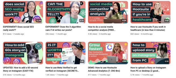


Source: Hootsuite Labs on YouTube
2. Establish a color palette for your brand
Deciding (and sticking to) a certain color palette or mood for your brand doesn’t just make your feed look beautiful: it also means your posts are instantly recognizable to your followers.
Incorporate visual content into your social media style guide, and establish recognizable, eye-catching visual content from the start.
For example, the nail polish brand Pleasing has a very, well, pleasing color palette. The company’s posts are bright, bold and unique: they stand out from the crowd.
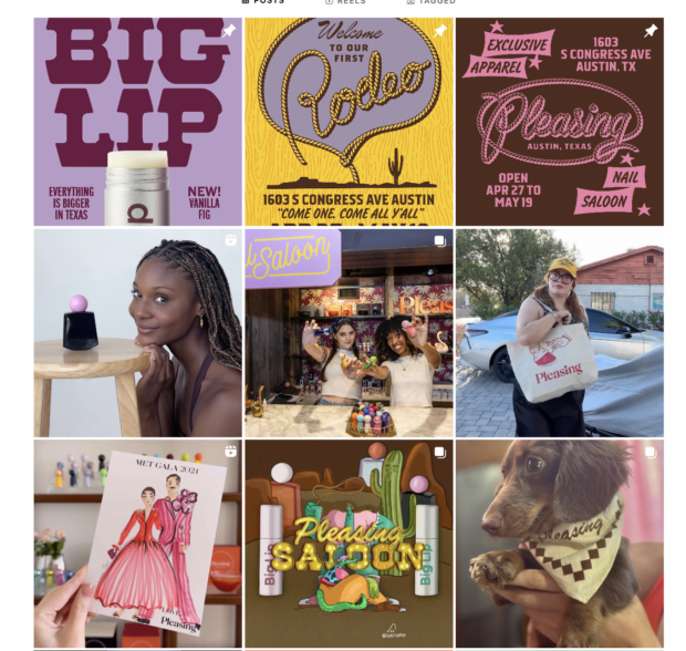


Source: Pleasing on Instagram
3. Incorporate text into your visual content…
Even if you work in a primarily text-based industry, you can still use visual content in marketing. One workaround is to use a compelling image with text overlaid.
You can take a page out of the book industry’s digital strategy. The main goal is to showcase a text-based story but publishers and authors will use visual means to promote said story.
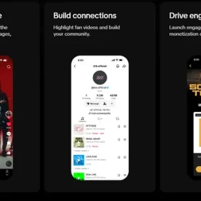
You just have to look up the TikTok phenomenon BookTok. BookTok promotes books of all sorts, and content creators often have text laid over their videos.
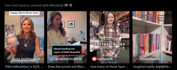


Source: BookTok on TikTok
4. …but don’t use too much text
While text can be a great tool for communicating information, it’s not easy on the eyes. In fact, too much text can be visually overwhelming for viewers. Less is more when it comes to adding text to your visual content.
In the example below, SAD Mag uses just enough text to tell the viewers what they need to know for their birthday event but not so much as to overwhelm them.
5. Use high-quality images and videos
Duh, right? Visual content is, first and foremost, visually engaging. You’ll want to make sure that you’re not posting blurry infographics or out-of-focus photos
High-quality photos and videos are nice to look at, and they also help showcase your brand. And, in some cases, the impact or effect of your brand. Beauty brands are often posting high-quality, well-lit videos to show off how their products look IRL.
6. Be aware of image copyright
Sourcing relevant images isn’t always easy, especially when it comes to understanding copyright. But it’s important, especially since there are serious consequences for misuse.
Read all the fine print when using stock photos, templates, and illustrations. If anything is unclear, inquire with the image owner or site for more details.
The same goes for licensing and contracting. When drawing up contracts with artists, it should be clear where you intend to use the creative, who owns the rights to it, and all that good stuff.
When it’s called for (which is often), be sure to give credit where credit is due. Like if you plan to repost or share user-generated content.
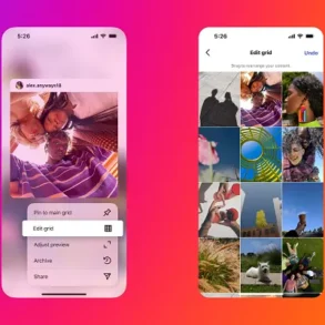
Instagram’s official Instagram often posts user-generated content, with the original poster credited in the caption.
7. Add your logo (where appropriate)
If you plan your visuals to be shared, it may be a good idea to include a logo.
Pinterest is a perfect example. Anything pinned has the potential of being repinned, and without a logo, it can be easy to forget where it came from.
Ikea includes its logo in nearly all of its pins (many of which are reshared tens of thousands of times).
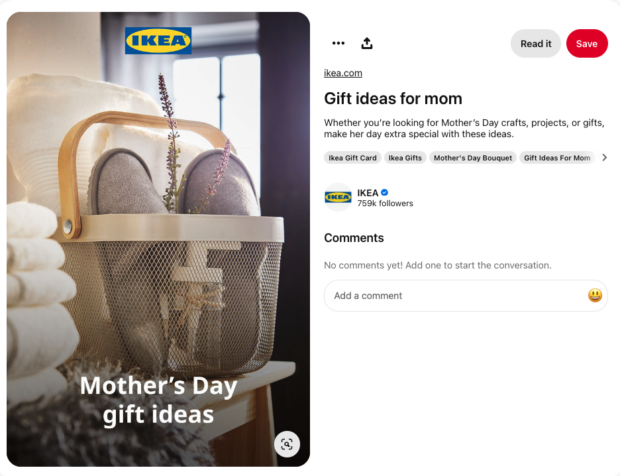


Source: IKEA on Pinterest
Good branding is noticeable but not obtrusive. Typically that means putting a small logo in a corner or the outer frame of the visual. If the color of your logo clashes or makes the visual too busy, opt for a greyscale or neutral version.
8. Include alt-text descriptions
When producing creative for social media, make it accessible for as many people and contexts as possible. Accessible content allows you to reach a broad audience and possibly edge out non-inclusive competitors in the process.
More importantly, it helps you earn respect and loyalty from your followers (and followers-to-be).
Accessible visual content on social media can include:
- Alt-text descriptions. Alt-text allows visually impaired people to better comprehend images. Facebook, Twitter, LinkedIn and Instagram now provide fields for alt-text image descriptions. Here are some tips for writing descriptive alt-text, along with specific guides for Facebook alt text and Instagram alt text.
- Subtitles. All social videos should include captions. Not only are they crucial for hearing impaired viewers, they help in sound-off environments as well. Language learners also benefit from subtitles.
- Descriptive transcripts. Unlike captions, these transcripts describe the important sights and sounds that aren’t spoken or obvious. Descriptive audio and live described video are other options.
9. Size images to spec
One of the biggest crimes you can commit when sharing visuals on social media is using the wrong size.
Images with the wrong aspect ratio or low resolutions can be stretched, cropped, and crunched out of proportion, all of which reflect poorly on your brand.
Every platform has its own specifications, and you should tailor your content accordingly. We’ve assembled a social media image size guide to help you.
Always aim for the highest image quality. That includes pixels and resolution.
And don’t ignore the aspect ratio. Why? Some platforms auto-crop image previews based on aspect ratio. If yours is different, you could end up with an unfortunate crop or important information left out.
10. Start videos with a hook
When making Instagram Reels, TikToks and even video content for Facebook, Linkedin and YouTube, focus on the first few seconds. If they’re engaging and entertaining, you’ll stop people from scrolling on past.
For examples of starting off visual content with a hook, look at culinary content creators; they’re excellent at drawing you in with the final product, so you’ll stay to learn the entire recipe.
The video below starts by literally saying STOP! Which, of course, helps to stop scrollers in their tracks.
11. Pay attention to trends
It’s important to stay up-to-date on what’s trending on every platform. This doesn’t just help you stay in touch with your audience; trends are a great source of inspiration if you find your creativity running dry.
Trends aren’t just visual, of course, but some of them have a visual element that is instantly recognizable—for example, the apple dance trend on TikTok (brat summer forever).
12. Take advantage of free tools and resources
It’s almost always best to hire a photographer or graphic designer to do custom content creation for your brand.
But if your budget is tight, or you’re in need of a few extra tools, there are countless resources available, and many of them are the best price of all: Free!
In the next section, we’ll dive deeper into free and paid tools you can use, but in the meantime, here are a few lists of design resources and tools:
Some social media management platforms have photo and video editing elements incorporated right into their dashboards. For example, Hootsuite has Canva.
No more switching tabs, digging through your “Downloads” folder, and re-uploading files. You can access Canva’s endless template library and create beautiful and effective visuals from start to finish without leaving Hootsuite Composer. Heaven.
While we’re on the topic, other Hootsuite features that can help you with your visual content strategy are:
To use Canva in Hootsuite:
1. Log in to your Hootsuite account and head to Composer.
2. Click on the purple Canva icon in the bottom right corner of the content editor.
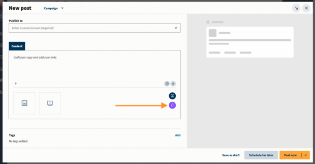


3. Select the type of visual you want to create. You can pick a network-optimized size from the drop-down list or start a new custom design.
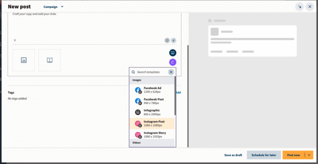


4. When you make your selection, a login pop-up window will open. Sign in using your Canva credentials or follow the prompts to start a new Canva account. (In case you were wondering — yes, this feature does work with free Canva accounts!)
5. Design your image in the Canva editor. You can use the paid or free templates for easy effort.
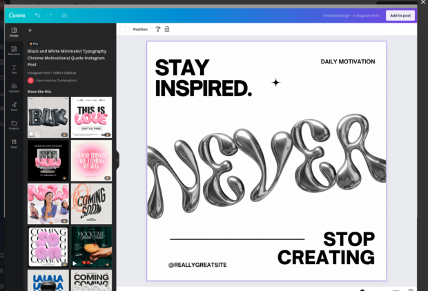


6. When you’re done editing, click Add to post in the top right corner. The image will automatically be uploaded to the social post you’re building in Composer.
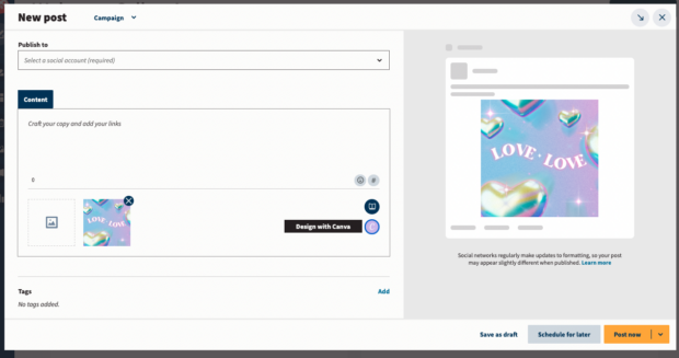


Then, you can go about your business as you usually do, adding a caption and hashtags and scheduling it to be published.
13. Schedule your visual content
You can craft the most engaging, thought-provoking, sharable visual content in the universe… but if people don’t actually see it, it won’t matter.
Because of the sheer volume of social media users, you’re always going to get at least a few viewers on your post. However, you can greatly increase your chances of your content taking off by posting when your target audience is actually using the platform.
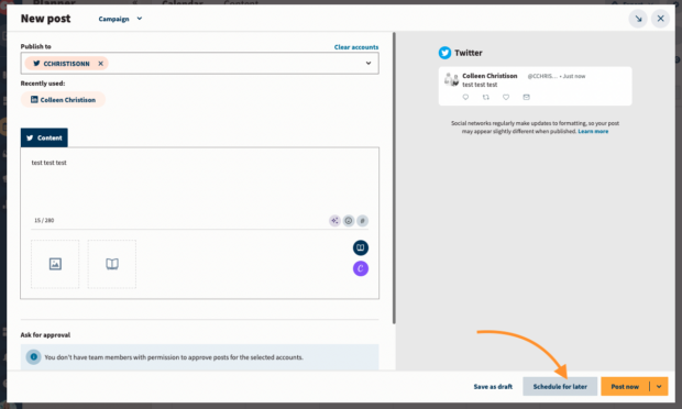
We’ve rounded up the best times to post on Facebook, Instagram, X (Twitter), TikTok and Linkedin so you can set yourself up for success. Set it and forget it (crock pot style) by using Hootsuite’s planner and scheduling tool to make sure your content goes live at the best time.


Still craving more advice? Try the latest guide to creating incredible content.
3 tools to help you speed up visual content creation
1. Canva
Canva is a powerhouse for creating visual content. The graphics editing app has made waves in the content creator community due to its ease of use. With Canva, you can pull together infographics, beautiful cover images and thumbnails, and illustrations in minutes.
Canva allows even us non-artists to create great graphics.
Canva has social media templates already customized to the platform of your choice, making it super easy to put together visual content. The tool is even (like we mentioned above) integrated within Hootsuite Composer, making content creation a breeze.
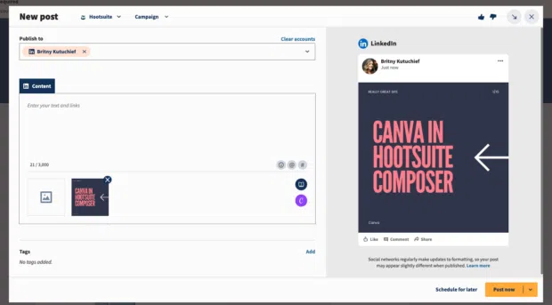


Source: Hootsuite
2. Dall-E
Dall-E, a brainchild of Open.ai, is an app you can use to create AI graphics. It’s simple to use, simply type in a text prompt of what you would like to see, and Dall-E will generate it for you.
Dall-E creates realistic art, but audiences are savvy and can typically pick up on whether something is created by AI. You may want to acknowledge the fact that your content is AI-generated.
You can use Dall-E to create original graphics for your social feed.
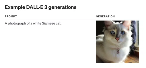


Source: Dall-E
3. Midjourney
Like Dall-E, Midjourney is another AI-powered app you can use to create graphics. Make sure you specify your prompts, the more specific you are, the better results you’ll get! The AI art prompting guide can help you create some winning text prompts.
You can use Midjourney to create social media graphics in a snap.
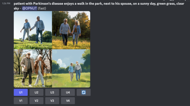


Source: Midjourney
Create, publish, and analyze beautiful visual content with Hootsuite. Publish and schedule posts, find relevant conversions, engage your audience, measure results, and more — all from one simple dashboard. Try it free today.
With files from Alyssa Hirose.
Better content in half the time
Boost engagement and save time with an AI writer, hashtag generator, and Canva in Hootsuite.
This post was originally published on this site be sure to check out more of their content
